Gadgets
I still can’t believe how bad the Google Wallet redesign is
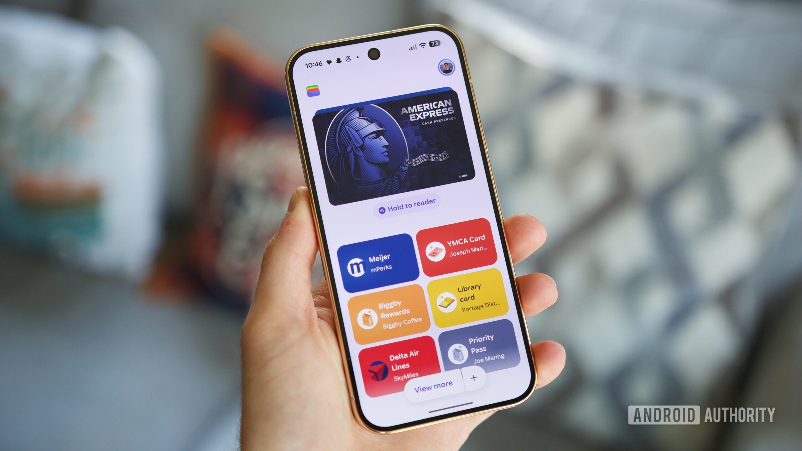
In early October, Google began rolling out a fairly big redesign to the Google Wallet app. After years of displaying credit/debit cards in a horizontal carousel, the app switched to a vertical list.
On paper, this doesn’t sound like that big of a deal. If anything, it made the Google Wallet home screen look a bit cleaner and more organized. However, after living with this redesign for the past month, I can’t stand it.
You're reading a preview. The full article is published by Android Authority on their website.
Read the full story on Android Authority